
Oct. 6, 2008 – Do you want to know the percentage of white women who support vice presidential candidate Sarah Palin? What about college-educated versus high school-educated white women? Or those who also hunt?
University of Utah computer scientists have written software they hope eventually will allow news reporters and citizens to easily, interactively and visually answer such questions when analyzing election results, political opinion polls or other surveys.
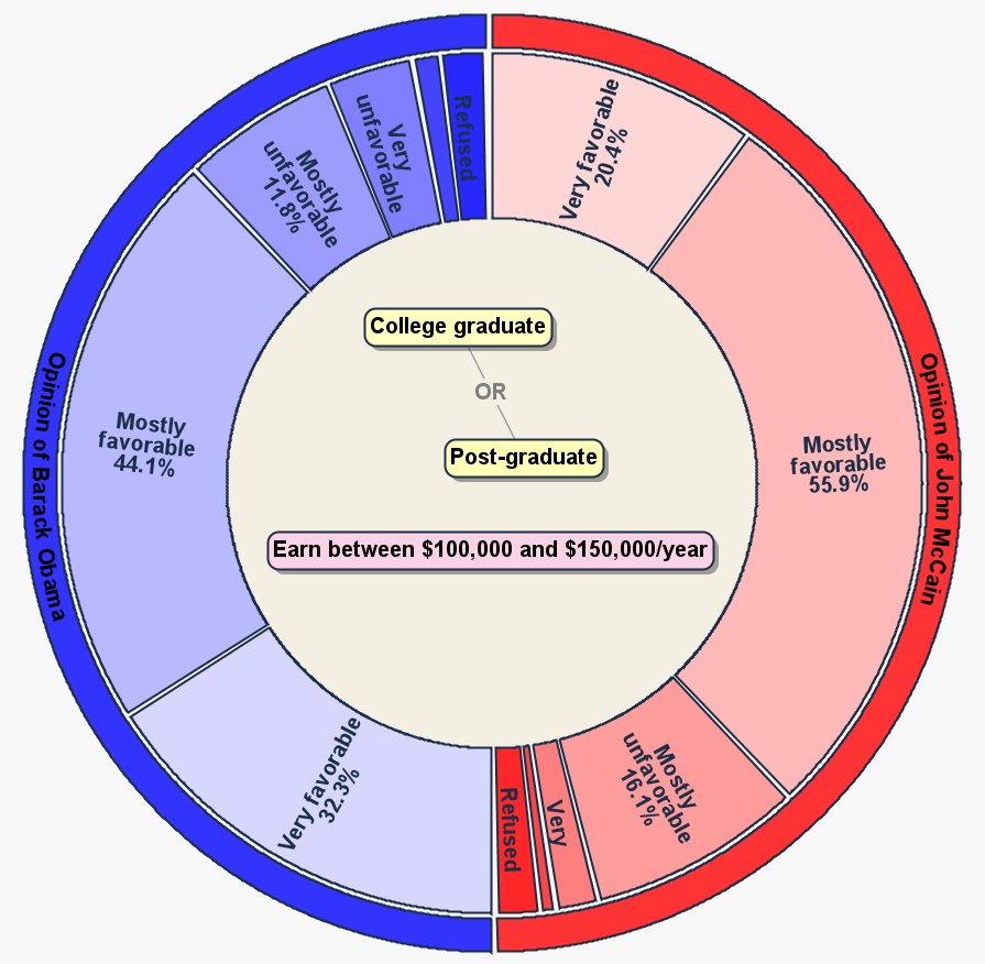
The software displays data in the form of “radial” charts that are doughnut-shaped and include features of traditional pie charts and bar graphs. The charts are interactive and animated so they change as a computer user asks to analyze poll results as a function of various demographic data.
“We have developed new techniques for exposing complex relationships that are not obvious by usual methods of statistical analysis,” says Richard Riesenfeld, a University of Utah professor of computer science and co-author of a study outlining the new way of visualizing polling data.
Geoff Draper, a doctoral student and researcher with the university’s Scientific Computing and Imaging Institute, devised the new method as part of his Ph.D. thesis. Riesenfeld is his thesis advisor.
“I wanted to create a way to make it easy for the masses to analyze data,” and that includes news reporters and television news anchors, says Draper, who is scheduled to present his study on Oct. 19 during the Institute of Electrical and Electronics Engineers (IEEE) Information Visualization Conference in Columbus, Ohio.
Analyzing the Numbers: From Elections to Diseases to Terrorism
When pollsters release their results, extensive survey data often are boiled down to a few key questions. TV news anchors and reporters cannot easily manipulate the data on the air to quickly answer a question that may arise, such as – in a college town – how full-time students feel about Obama and McCain.
To produce tables and graphs with common poll-analysis software, users must receive training, and then manipulate a spreadsheet containing large grids of numbers.
“If you generate a graph and don’t like the way it looks, you cannot change the graph just by manipulating the graph itself,” says Draper. “You have to go back to the source data. You have to throw away the graph and start over.”
Charts in the new software are animated and change in real time as a person uses a computer mouse to drag and drop parameters – such as “female,” “black” or “income over $50,000” – into the center of the doughnut-shaped chart displaying poll results.
“Rather than navigate an external interface, queries [new questions about poll results] are constructed directly within the visualization itself,” Draper and Riesenfeld wrote in their study outlining the new method.
Despite developing the software to analyze poll or election results, “the tool is general enough to let you analyze any type of demographic data,” Draper says, noting that a university might use it to easily categorize students by various demographic groups. The software also could be used by health officials to analyze demographic characteristics of patients with a certain disease, or by homeland security officials and police to look for common factors among known terrorists or other criminals.
How the New Software Works
The software produces charts with three parts:
- An outer ring listing one or more questions asked during a survey, such as, “What is your opinion of John McCain?” and “What is your opinion of Barack Obama?”
- An inner doughnut hole that is used to narrow the question to certain demographic groups. If the hole is empty, the answers to the questions come from all respondents to the poll. But the software user can click on a menu, then drag into the hole parameters such as “college graduate or post-graduate” and “earn between $100,000 and $150,000 per year.”
- The poll results are shown in a large middle ring between the outer ring and the inner hole. The large ring is divided into curved bars – somewhat like pie slices with their tips chopped off – and each bar lists an answer and related percentage (such as “Mostly favorable, 48.1 percent” under “Opinion of John McCain”). When the center hole is empty, the results list the percentages of all survey respondents with opinions of McCain and Obama that are “very favorable,” “mostly favorable,” “mostly unfavorable” and so on. When parameters such as education and income are dragged and dropped into the center hole, the results shown reflect only the opinions of those groups shown, such as college grads and post-graduates with incomes between $100,000 and $150,000 per year.
Draper says his poll-analysis software is not quite ready for prime time.
“Right now it is an academic project. My goal is to get the idea out there and let other software developers incorporate our visual methods into their products. The software would be useful for news reporters to go on the air and move the icons around and show how different demographic groups voted, how they feel about certain issues. Eventually, it might be used by the general public.”
Draper tested the software using exit polling data for the November 2007 election on two ballot measures and the election of Salt Lake City Mayor Ralph Becker. He asked two political science professors and 52 novices to try it. They were asked to use the software to perform nine analysis tasks, such as, “What percentage of women voted for Ralph Becker?” and “Of those voters whose location is east of State Street, what percentage earned a post-graduate degree?”
Eighty-eight percent said they enjoyed using the software and 71 percent completed all the tasks without errors.
Draper named the new software Simple Query Interface with a Radial Layout, or SQiRL (pronounced “squirrel”).
A video demonstrating the new poll-analysis software may be viewed at the following address. It may take a few minutes to load:
http://www.sci.utah.edu/sci_gallery/radial_charts/2008_Dartboard.mov
(Credit video to Geoff Draper and Chems Touati, University of Utah Scientific Computing and Imaging Institute.)
For more information about the University of Utah College of Engineering, see: